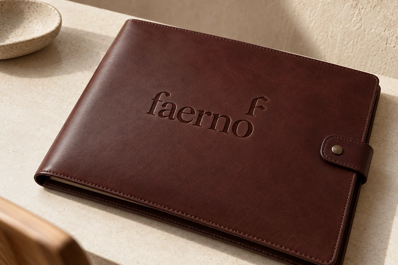
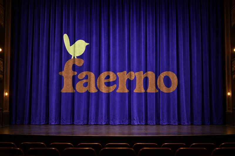
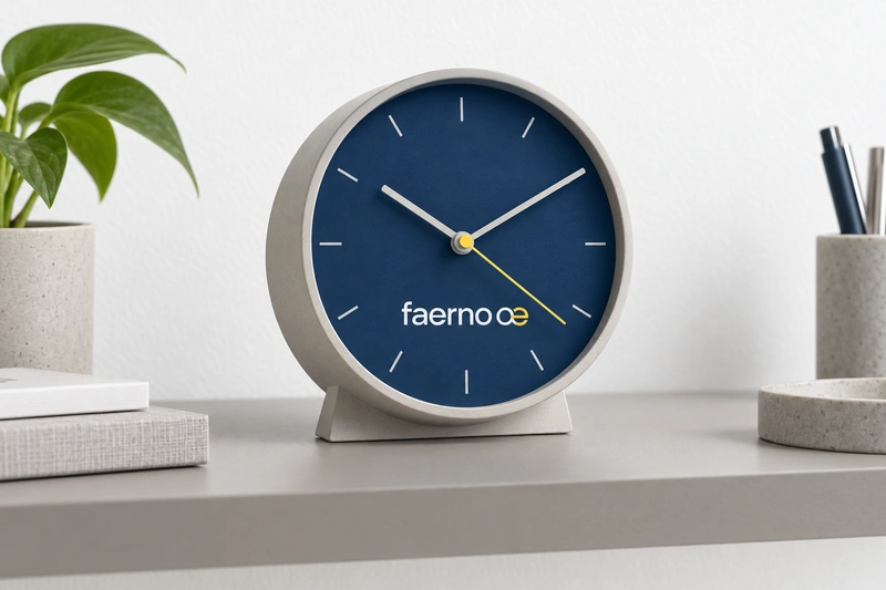
Faerno has the compact presence of a label and a gently flowing finish. Its unusual vowel pairing gives it an individual written character without making the whole name visually elaborate. It could feel personal and authored on an object, or serve as the umbrella for a studio, venue or collection.
The strongest applications give that character something tangible to express: carefully made accessories, considered interiors, cultural experiences or approachable tools. A design-led business could use Faerno to suggest a consistent point of view rather than a particular product category. The name leaves room for expansion, but it does not explain an offer by itself. Clear introductory language would matter, as would choosing a pronunciation and using it consistently wherever customers first encounter the brand.
Name analysis
Faerno contains six letters, with no numbers or hyphens. The initial f gives way to the adjacent a and e, followed by rn and a final o. In English, FAIR-no is a plausible two-syllable reading, but some readers may choose FER-no or separate the vowels into FAY-er-no. That uncertainty is the main friction in an otherwise manageable name. The final o gives the word an audible stopping point, while the uncommon fae opening helps distinguish it in writing. Some audiences may perceive a surname-like or fantasy-tinged quality; these are possible impressions, not claims about origin or meaning. No specific linguistic derivation is established by the supplied material.
Assessment summary
Faerno is a compact, visually distinctive name with a particularly convincing fit for authored design and character-led cultural brands. Its written identity is stronger than its spoken predictability. It can also support a contemporary tools or advisory business, although that positioning would need explicit explanation.